Level Up Your Style: Advanced CSS Techniques for Modern Web Design

Modern web design demands more than just basic styling. To create truly engaging and responsive websites, you need to master advanced CSS techniques. Let’s explore some powerful tools and concepts that will elevate your web design skills.

1. CSS Grid for Complex Layouts:

CSS Grid is a game-changer for creating intricate and flexible layouts. It allows you to define rows and columns, place elements precisely, and build responsive designs with ease.

  • Defining Grid Containers: Use display: grid; to create a grid container.
  • Grid Templates: Define rows and columns using grid-template-rows and grid-template-columns.
  • Grid Areas: Name areas within your grid and place elements using grid-area.
  • Responsive Grids: Utilize repeat() and minmax() functions for flexible and responsive grid layouts.

2. Flexbox for Dynamic Content Arrangement:

Flexbox excels at arranging items within a container, making it ideal for navigation bars, content blocks, and dynamic layouts.

  • Flex Containers: Use display: flex; to create a flex container.
  • Flex Direction: Control the direction of items using flex-direction.
  • Justification and Alignment: Align items using justify-content and align-items.
  • Flex Grow and Shrink: Control how items expand or shrink using flex-grow and flex-shrink.

3. CSS Variables (Custom Properties):

CSS variables allow you to define reusable values, making your CSS more maintainable and dynamic.

  • Defining Variables: Use --variable-name: value; to define variables.
  • Using Variables: Use var(--variable-name) to access variable values.
  • Dynamic Changes: Update variable values using JavaScript for dynamic styling.

4. CSS Animations and Transitions:

Create engaging and interactive experiences with CSS animations and transitions.

  • Transitions: Smoothly change property values over time using transition.
  • Animations: Define keyframes to create complex animations using @keyframes and animation.
  • Performance Optimization: Use transform and opacity for hardware-accelerated animations.

5. CSS Shapes and Clipping:

Create unique visual effects with CSS shapes and clipping.

  • clip-path: Define complex shapes using clip-path and SVG paths.
  • shape-outside: Wrap text around complex shapes using shape-outside.
  • Polygon Clipping: Create polygon shapes using clip-path: polygon().

6. Advanced Selectors:

Target specific elements with precision using advanced CSS selectors.

  • Attribute Selectors: Target elements based on their attributes.
  • Pseudo-classes and Pseudo-elements: Style elements based on their state or insert generated content.
  • Combinators: Combine selectors to target specific relationships between elements.

7. CSS Filters and Blend Modes:

Enhance visuals with CSS filters and blend modes.

  • Filters: Apply effects like blur, grayscale, and brightness using filter.
  • Blend Modes: Blend elements with their background using mix-blend-mode and background-blend-mode.

8. Logical Properties and Values:

Create layouts that adapt to different writing modes and languages.

  • inline-start and inline-end: Replace left and right for internationalization.
  • block-start and block-end: Replace top and bottom for internationalization.

9. CSS Containment:

Improve performance by isolating parts of your website for rendering.

  • contain: layout: Isolates layout calculations.
  • contain: paint: Isolates painting operations.
  • contain: size: Isolates size calculations.

10. CSS Feature Queries:

Apply styles based on browser support for specific CSS features.

  • @supports: Test for browser support of CSS properties and values.

By mastering these advanced CSS techniques, you can create modern, responsive, and engaging websites that stand out from the crowd.

The Essential Elements of a User-Friendly Website

In today’s digital age, your website is often the first point of contact between your business and potential customers. A user-friendly website is crucial for making a positive impression and driving conversions. But what exactly makes a website “user-friendly“? Let’s explore the essential elements that contribute to a seamless and enjoyable online experience.  

1. Clear and Intuitive Navigation:

  • Simple Menu Structure: A clean and organized menu is essential. Avoid overwhelming users with too many options.
  • Logical Hierarchy: Ensure your pages are organized in a logical and intuitive way, making it easy for users to find what they’re looking for.
  • Search Functionality: Implement a robust search bar, especially for websites with extensive content.
  • Breadcrumbs: Use breadcrumbs to show users their current location and allow them to easily navigate back.

2. Fast Loading Speed:

  • Optimize Images: Compress images to reduce file sizes without sacrificing quality.
  • Minimize HTTP Requests: Reduce the number of elements that require loading, such as scripts and stylesheets.  
  • Leverage Browser Caching: Enable browser caching to store static resources on the user’s computer.
  • Use a Content Delivery Network (CDN): Distribute your website’s content across multiple servers for faster delivery.

3. Mobile Responsiveness:

  • Responsive Design: Ensure your website adapts seamlessly to different screen sizes and devices.
  • Mobile-Friendly Navigation: Optimize menus and navigation for mobile devices.
  • Touch-Friendly Elements: Make buttons and interactive elements large enough for easy tapping.
  • Fast Mobile Loading: Prioritize mobile loading speed, as mobile users are often on slower connections.

4. Clear and Concise Content:

  • Easy-to-Read Fonts: Choose legible fonts and appropriate font sizes.
  • Short Paragraphs and Bullet Points: Break up large blocks of text with short paragraphs and bullet points for easier reading.
  • Effective Use of Headings: Use headings (H1, H2, H3) to structure content and improve readability.
  • Clear Calls to Action (CTAs): Use strong CTAs to guide users towards desired actions.

5. Visual Appeal and Consistency:

  • Consistent Branding: Maintain a consistent visual style across all pages, including colors, fonts, and imagery.
  • High-Quality Images and Videos: Use visually appealing and relevant images and videos.
  • White Space: Utilize white space to create a clean and uncluttered design.
  • Appropriate Color Palette: Choose a color palette that reflects your brand and is easy on the eyes.

6. Accessibility:

  • Alt Text for Images: Add descriptive alt text to images for screen readers.
  • Keyboard Navigation: Ensure your website can be navigated using a keyboard.
  • Sufficient Color Contrast: Use sufficient color contrast between text and background for readability.
  • Accessible Forms: Design forms that are easy to fill out for users with disabilities.

7. Security and Trust:

  • HTTPS: Use HTTPS to encrypt data and protect user privacy.
  • Privacy Policy and Terms of Service: Provide clear and accessible privacy policy and terms of service pages.
  • Security Badges: Display security badges to build trust.
  • Contact Information: Make it easy for users to contact you with questions or concerns.

8. User Feedback and Testing:

  • Analytics Tracking: Use analytics tools to track user behavior and identify areas for improvement.
  • User Testing: Conduct user testing to gather feedback on your website’s usability.
  • Feedback Forms: Implement feedback forms to collect user suggestions.

By incorporating these essential elements, you can create a user-friendly website that not only looks good but also provides a positive and engaging experience for your visitors, ultimately driving conversions and building brand loyalty.

What is UI/UX and Why Does It Matter for Your Website?

In today’s digital landscape, a visually appealing website isn’t enough. To truly capture and retain visitors, you need to create an experience that’s both intuitive and enjoyable. That’s where UI (User Interface) and UX (User Experience) come into play. But what exactly are they, and why are they crucial for your website’s success?

Understanding UI (User Interface):

UI refers to the visual elements of your website that users interact with. Think of it as the “look and feel.” It encompasses everything from:

  • Layout and Design: The arrangement of elements, color schemes, typography, and visual hierarchy.
  • Interactive Elements: Buttons, forms, menus, icons, and animations.
  • Branding: Consistent use of logos, colors, and fonts to reflect your brand identity.
  • Responsiveness: Ensuring the website adapts seamlessly to different screen sizes and devices.

A well-designed UI is visually appealing, easy to navigate, and consistent. It focuses on clarity, simplicity, and efficiency, allowing users to quickly find what they need.

Understanding UX (User Experience):

UX, on the other hand, focuses on the overall experience a user has while interacting with your website. It’s about how users feel, how easily they can achieve their goals, and how satisfied they are with the process. Key aspects of UX include:

  • Usability: How easy it is for users to navigate and complete tasks on your website.
  • Accessibility: Ensuring your website is accessible to users with disabilities.
  • Information Architecture: Organizing content in a logical and intuitive way.
  • User Research: Understanding user needs, behaviors, and pain points through surveys, interviews, and analytics.
  • User Testing: Evaluating the website’s usability through testing with real users.
  • Emotional Connection: Creating a positive and engaging experience that resonates with users.

A good UX design prioritizes user needs and aims to create a seamless, enjoyable, and efficient interaction.

Why UI/UX Matters for Your Website:

  • Increased User Engagement: A well-designed UI/UX keeps users engaged and encourages them to explore your website.
  • Improved Conversion Rates: A seamless user experience makes it easier for visitors to complete desired actions, such as making a purchase or filling out a form.
  • Enhanced Brand Reputation: A positive user experience builds trust and credibility, enhancing your brand’s reputation.
  • Reduced Bounce Rates: A user-friendly website encourages visitors to stay longer and explore more pages.
  • Improved SEO: Google considers user experience when ranking websites. A well-designed website can improve your search engine rankings.
  • Increased Customer Loyalty: A positive user experience fosters customer loyalty and encourages repeat visits.
  • Reduced Support Costs: An intuitive website reduces the need for customer support, saving you time and money.
  • Competitive Advantage: A website with excellent UI/UX can set you apart from your competitors.

Investing in UI/UX is an investment in your website’s success. By prioritizing user needs and creating a seamless, enjoyable experience, you can build a website that not only looks good but also performs exceptionally well.

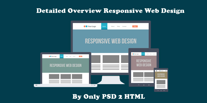
Detailed Overview Responsive Web Design

The wind of advancement has affected the scenario of single desktop screen with the expansion of mobile websites at each nook and corner of the web. Site owners need to have a keen eye on how their work is showcased across various devices. Responsive website design is the ultimate solution to safeguard them from the chances of losing visitors from one device so as to gain visitors from another. RWD offers a perfect compatibility as correspondent to each screen size and devices like for mobile, tablet, iPhone and iPad, along with laptops and desktops.

Running a successful web design company means never standing still, constantly learning about web design and mastering new web technologies as they become available. Lately, you may have heard the term Responsive Web Design thrown around in your marketing meetings. One of the latest buzz words, Responsive Web Design signifies a total paradigm shift in the design process. Similar to the impact that CSS had on the web design world, Responsive Web Design will alter the way we view and use sites. Smart web designers and and companies will quickly become familiar with it and put it into play.

In recent years, the internet has experienced a drastic rise in mobile website traffic. According to research firm Gartner, browser-equipped phones will outnumber traditional computers at some point during the year 2013. And although cellphones are yet to be users primary browsing device, Gartner projects users to make that transition by 2017.

This transition has propelled most companies in-the-know, to build versions of their website dedicated to mobile devices. The internet provides users with plenty of options, and website visitors now expect a positive experience. Oftentimes, elements of a desktop website are misaligned, unavailable, or are simply too small when browsed on a mobile device. This is not a knock on the original design, but visitors quickly translate this poor user experience with a company’s website. And thus the level of service or product-satisfaction they expect to receive.

Why Responsive Web Design?

With an ever-growing number and types of web-enabled devices, web designers must ensure an optimal user experience. Essentially there are two approaches for solving the multiple-devices dilemma.

The traditional method was to create multiple versions of a website, and then serve the appropriate versions based on the type of device being used by the visitor. This approach is relatively simple, as each version of the website exists independently of the others. Due to this separation, changes can be made to each version without affecting the others. However, this freedom comes at a fairly high price. First, designers have to design and build each version of the website. This isn’t just time-consuming for designers, but more expensive for clients. Additionally, as the number and types of devices continues to grow, it is becoming exceedingly difficult to address each one appropriately.

The new and improved approach to tackling the multiple-devices issue is responsive web design. When you boil down the differences between each web-enabled device, the most significant is screen resolution. This method allows for one website to, literally, transform itself based on the device on which it is being rendered.

What is Responsive Web Design

The principles of responsive web design can be understood from a saying that defines“content is like water.” It means that it can take the shape of the device in which it is placed.

Responsive web design is a worthful approach which demands that the design and development of a website must respond to the user’s behavior and environment, as per the platform, screen size and orientation. It employs a fair combination of images, adjustable grids and layouts and a smart use of CSS media queries.

With the release of the CSS3 specification, W3C created media queries which allow us to target various characteristics of the device being used, and conditionally apply certain styles based on those characteristics. Previously, some designers tested Javascript-dependent implementations of resolution-aware layouts. However, the advantage of the current CSS3 technology is that it allows us to look at more than one property in a single query. We are now able to test multiple property values and chain them into one query.

We can now serve different styles based on a set of defined rules. This ability gave rise to Responsive Web Design, as we can now have one website, respond to specific conditions and present itself in a way that promises optimal user experience. Images can be now be re-sized, columns moved and reordered, elements hidden, font-size altered, and more, all on the fly.

As we know, with great power comes great responsibility and this new flexibility is no different. We must now plan ahead and decide how we use fluid grids, flexible images and media queries to allow our layout to be molded with each viewing context.

Why is Responsive Design So Important?

Responsive web design concept is not merely about adjusting screen resolutions and automatic resizable images, but it is a very broad approach about thinking for a design differently. In the recent times, the ultimate solution is to create such design that can work and must respond to the multiple browser versions. You have open doors for testing your website on various devices.

Some Important Credentials of RWD:

  • Know Your Audience: RWD is the answer to most of the businesses which helps them in knowing their audiences and the device that they are using.
  • A Prompt UX: User experience is the key to RWD and it goes much beyond translating a desktop site into mobile screen. Here, the points to be taken into consideration are user experience, necessary content they are looking for and their interaction.
  • Focus on Content: To design the site as per the content is a good habit to follow during responsive designing instead of a specific screen dimension.
  • Limited Space Consumption: The mobile view is much more focused as compared to the desktop with limited amount space usage.
  • Easy Navigation: The design needs to be flexible enough for a relaxing UX and the complex designs must need to adapt to the simple intuitive UI for small mobile screens.

What Website Dimensions Should be Used ?

We cannot specify a standard website size as there are hundreds of devices available along with plentiful screen resolutions out there. Each user works on the different device as per the usage, like an individual may explore something on your mobile while on the way or may even use the laptop while working on some task in office. So, the best approach here is to design multiple versions as per the different browsers’ widths.

Mobilegeddon: Google’s New Update for Mobile-friendly Sites

Responsive web design is an important aspect for the mobile traffic. For this, Google announced an important update Mobilegeddon on 21 April 2015. Each business of varying size will catch Google’s attention if their site follows friendliness with the mobile devices. This approach is followed by keeping in mind the fact that the mobile device users are increasing at a rapid rate and to keep them in reach, it is crucial to have mobile friendly web pages for offering a sound user experience.

Elements of RWD

An RWD site adapts the layout to the viewing environment via using fluid, flexible images, proportion-based grids, and CSS3 media queries (an extension of the @media rule) in the following ways:

  • The Fluid Grid concept allows page element sizing in relative units such as percentages, instead of absolute units i.e pixels or points.
  • Flexible images also follow sizing in relative units so that they can be prevented from showcasing outside the containing element.

Media queries enables a page to use different CSS style rules in accordance with the features of the device on which a website is being displayed, like the width of the browser.

Fluid Grids

They follow percentage values instead of set pixels while designing a website. After following this concept, the elements in the mobile screen layout will be resized in relation to each other. It tends to render content in the same order as it appears in the DOM, and it prompts reflow of content during its resizing. Fluid layouts also counts for relative resizing of both content and containers which allows the text and content to be enlarged and shift other content automatically at the bottom of the page.

Media Queries

It is the code which has been implemented to a website while it is being made, to set the conditions in a design that will adapt to the screen size. Media queries are used to provide different CSS as per the device properties.
Like for say, specifically for iPad, there is a unique media query property known as orientation. The values vary for landscape and portrait.

@media screen and (orientation: landscape) {
.iPadLandscape {
width: 30%;
float: right;
}
}

@media screen and (orientation: portrait) {
.iPadPortrait {
clear: both;
}
}

Google’s Resizer

It is a useful approach to preview your website with ease on multiple devices. Resizer is made to simply test the viewability of a website. It can be understood as a tool to check the responsiveness of the website by changing the dimensions of a web page. Being a browser based tool, you have with you a series of predefined icons, once it has been activated.

Flexible Images

Images with utmost flexibility are really important for designing a responsive website.
There are several points to consider including image scaling, how will it appear on different devices including large desktop, tablet and a small mobile screen. The code Images are allowed to scale with the code through a percentage value to the width of the browser window.

Image resizing can be efficiently incorporated with the below code-

<meta name=”viewport” content=”width=device-width; initial-scale=1.0″>

Inspiration

As with any design project, find other websites that execute responsive web design in creative ways.

This can be as simple as thinking about the following questions:

  • Which websites or apps you frequently use on your mobile phone or other portable devices?
  • Why do you prefer one site over others that might provide similar services?
  • Do you prefer their mobile experience or desktop experience?

Finding answers to these questions can help you find pain points that you may have never noticed during your everyday browsing.

The future of responsive design for mobile

We now know that Google is requiring the following optimized elements for an effective mobile-friendly user experience:

  • Text that is at a readable size, without the need for zooming
  • Content which fits a device’s screen, without the need for horizontal scrolling
  • Links & buttons which are adequately spaced out, so that tapping is not difficult
  • Reasonable load times for pages
  • No use of Flash!

The rise in mobile devices is only the beginning of a shift to more convenient web usage. As wearables such as smart watches become more popular, it’s necessary to make sure your website can be viewed anywhere by your users on any device.