Bootstrap is a front-end framework used for websites and web application development. It has HTML and CSS-based design templates, which can be used for typography, buttons, navigation, forms and various interface components. It also has optional JavaScript extensions.
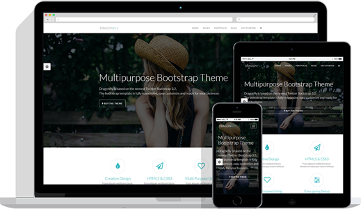
Bootstrap is a popular mobile first, HTML, CSS and JS framework for developing responsive, mobile first projects on the web. It was first developed as Twitter Blueprint to assist Twitter developers in working more efficiently and consistently. The name was then changed to Bootstrap and was launched for developers to use for front-end web development that helps in improving the user experience for the web projects. Follow our previous blog for preliminary information on creating websites with Bootstrap.
Benefits of Using Bootstrap for WordPress
With the evolution of mobile products, people are looking for alternatives for conventional web platforms. WordPress is the most common type of web platform that has been used for development of many sites. It allows easy usage, dynamic visual flow with interactive blogging and SEO. Bootstrap is comparatively new but rapidly growing website style, which works to make your website compatible with any device. Benefits of theming with Bootstrap are:
- It is responsive and mobile first
- It uses clean, attractive and modern designs
- It plays well with HTML5.
- It gives easy access to scripts.
For tablet or computer, WordPress is good enough and has more visually appealing and conceptual themes as compared to Bootstrap. WordPress websites use more memory while loading, due to the high-end designs of WordPress, which slows down the loading speed of the website on phone or other mobile devices.
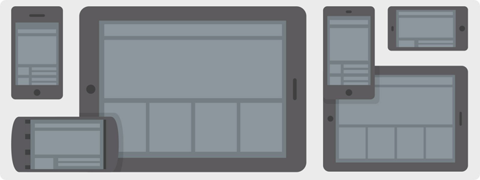
Bootstrap, being equally good, best suited for mobile phones and all small screen devices. Based on the size of the viewing window, Bootstrap’s dynamic design allows text and the page changes. So you don’t need to use side scroll while using the site on the phone, but scrolling up and down is there to browse the site completely. As Bootstrap uses less memory for loading as compared to WordPress, it helps in better loading performance on mobile devices.
Free Bootstrap themes and templates
Start Bootstrap provides open source and easy to use the collection of Bootstrap themes and templates, which can be used for website development and can also be used commercially. It provides themes in various categories such as full websites, one-page websites, landing pages, blogs, portfolios, e-commerce, admin and dashboard, starter template and many more.
Wrap Bootstrap
Wrap Bootstrap is a marketplace for premium templates and themes of Bootstrap. It provides you a single but solid foundation for developing impressive and responsive websites and web applications. It also allows designers to upload and sell their customized default styles and earn the percentage on each sale.
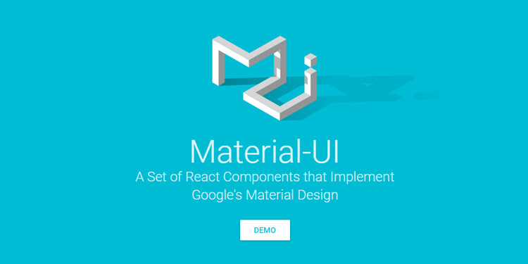
Material Design for Bootstrap
Material Design for Bootstrap (MDB) is a powerful Material Design UI kit for the Bootstrap framework. MDB is a theme built using Bootstrap 3, which implements Google’s material design. The latest version for MDB is version 4.2.0. It offers Bootstrap elements dipped in material design that includes navbars, tabs, buttons, typography, sliders, progress bars, bootstrap ready to use layout, responsive CSS3, grid system and other things which are material design. No need to build the website from the scratch, you get a ready theme to customize and you will have the material design based UX/UI.
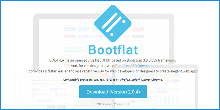
Responsive Bootstrap flat design
Bootflat is an open source Flat UI kit based on Bootstrap CSS version 3.3.0 framework. It offers easier and faster ways for designers and developers to create elegant web apps. It was visioned as a stunning flat design and built with Sass 3.4.9.
Highlights of Bootflat:
- Bootflat uses lightweight, high-function plugins for optimum performance and keeps down the CSS and JS file sizes.
- Bootflat, built with mobile-first in mind, provides off screen navigation and all the widgets are compatible with all the screen sizes.
- Bootflat UI kit is PSD Interface Pack that includes a set of beautiful components that can be used to create beautiful websites as well as iOS/Android apps.
Plugins for bootstrap
Bootstrap’s plugins and extensions are not really limited. There are numerous free and premium extensions and add-ons available for extending Bootstrap. It comes with bundles of jQuery plugins and reusable components. Also, it gives you the choice, whether you want to use it or not. Access all the Bootstrap resources and plugins here.
Latest Bootstrap 4 Alpha 5 Release
Alpha 5 arrived just over a month after Alpha 4 with some major feature improvements and loads of bug fixes. Bootstrap 4 is getting more stable with each alpha release. Alpha 5 release brought following updates:
- New CSS bundles
- Grid updates
- Navbar updates
- More utilities
On the way to Alpha 6 release
Bootstrap has revealed that one more major alpha release, alpha 6, before getting into the slightly more stable beta ships. There’s still more to expect around major components — the navbar, flexbox variants, utilities, and accessibility.
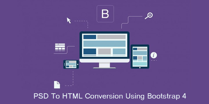
Confused about choosing the best suited web platform for your business? Feel free to Only PSD 2 HTML. Our expert Business Analysts will help you choose the best platform to PSD to HTML for your Website. We offer customised psd to html5 Conversion services at competitive pricing. We have already associated with many of the startup organizations and helped them to get their business on world wide web. Navigate through our portfolio to have a look on our previous website development works. Only PSD 2 HTML Offer PSD To Bootstrap Converion Service in $99 USD