10 Benefits of PSD To Responsive HTML Conversion

PSD To Responsive HTML Conversion  is the approach to building a website so that it responds to the end user’s viewing environment, platform, screen-size and viewing orientation. The practice consists of a mix of flexible grids and layouts, images and an intelligent use of CSS media queries.

Now a day’s users view websites on a multitude of devices including PCs, Tablets, Laptops, Smart Phones and even their TV therefore a Responsive Website should now be the default mode.

Over the last few years, Bootstrap has become an increasingly popular front-end development framework. More and more developers and designers continue to get on board. Evidently, there’s a reason for that.Most of developer is using bootstrap for Convert PSD To HTML.

1. Increasing Tablet and Mobile Audience

With 40%+ traffic on a majority of our customers’ websites now coming from mobile devices you would be excluding a large proportion of your potential new customers from having an enjoyable browsing experience with your website.

Traditionally users have been redirected to separate mobile websites however the latest web technologies allow us to serve different resolution-specific content without having to reload the web page or redirect the user.

2. Return on Investment

Well, actually with Hostpipe’s packages, there is no additional investment for making your website responsive.

Our core philosophy surrounds ensuring that we adhere to Web Standards Compliance, and with the addition of a simple plug-in (BootStrap) and a few tweaks to the code it can be as simple as producing a different stylesheet for print.

3. Increase Sales and Conversions

Your website is a sales tool and in many cases will provide the first impression of your company to potential new clients, therefore a well polished, responsive website will ensure that you give the best first impression.

Not only that but when the client visits your full website they will see a consistent brand and image, with the resulting positive impact leaving a trustworthy imprint.

4. Search Engine Friendliness

There’s no doubting that Search Engines now grade websites on how responsive they are, and so with well organised content being served to the search engines through a well equipped responsive framework you are more than likely to get a few bonus points from the Search Engine’s complicated algorithms.

Not only that but Search Engines are more likely to display mobile content when you are on the move and viewing searching for stuff via 3G, so if it receives a search query from a mobile device it is more likely to give preference to mobile enabled websites in its search results.

5. Save time Managing Site Content

A truly responsive website means that you can create one set of content within your content management system (CMS) and then leave it down to the template your website developer has created to determine how that is handled. No more writing two sets of content for mobile and web.

At the end of the day why should you have to change your marketing and business logic just because the website framework doesn’t allow it? One product = one page of content. Shimples!

6. Stay Ahead of the Competition

Many websites are still not paying attention to the changing requirements and the need for responsive design. Therefore if your website is responsive, the likelihood is you will be one step ahead of your competition.

7. It will Future Proof your Website

Basically a truly responsive website will adapt the content to fit on any screen size and resolution, therefore your website is likely to work on the next new-fangled, crazy device which Apple or Google throw at us.

8. Keep your Analytics in one place

Simple really, a single URL means a single set of analytics to look at and decipher making it easier to examine the goals you’ve set and the funnels your site visitors have travelled through to reach those goals.

9. Additional Features of Mobile Devices

Mobile devices make great use of their in-built technology such as cameras, compass, geolocation GPS and accelerometer. The benefits of responsive website design in relation to this is that your company can use these features to enhance the mobile user’s experience.

10. Daft not to Take Advantage of any of the above

OK, so I couldn’t actually come up with a tenth benefit because all of the above benefits collectively will have such an impact on your website it simply seems daft for you not to make your website Responsive.

Only PSD 2 HTML Offer PSD To Bootstrap Conversion in $99 USD & PSD To HTML5 Conversion in $79 USD.

Bootstrap Benefit While Convert PSD To HTML

Bootstrap: Trending / Benchmark /Pre-built CSS Framework For Optimal Results

Tablets, smart phones and other mobile devices have become the most important need of modern life. Thus, building of responsive, well-structured, remarkable, high-performing and result-oriented website with stylish design is essential to improve the growth of a site within a smaller amount time. The conversion Of  PSD To HTML5 is considered to be the ultimate, but daunting task to get the comprehensive results with the best viewing experience.

Importance of Bootstrap in Quality Conversion

The perfect execution of the latest technological features is required for the growth of a website. There is no confusion that Bootstrap is a standard framework to meet the versatile business needs. Having a collection of CSS/HTML templates & tools, it makes the PSD To Bootstrap Conversion & PSD To HTML Conversion process easier for the developers by helping them create CSS code. The performance, design and success of a website are considered to be incomplete without powerful conversion & goal-centric structure.

Benefits of Bootstrap While Convert PSD to HTML

  • Mobile First

Mobile first approach is the core feature of Bootstrap 3, which facilitates you to redesign & rebuilt everything to provide the best user experience on different handheld devices of various screen sizes. With many changes, the latest version of this framework has come with flat style & optional theme to provide 2.0-er look. Besides these, font has been replaced to icons from the images to fulfill the need of using different colors and sizes.

  • Development Speed

Bootstrap is definitely the advantageous open source framework to build the new website/application quickly with fast development speed. Rather than start structuring code from the scratch, it offers pre-built blocks of code and CSS LESS functionality to save the coding hours. You can also choose the fastest route and buy ready-made themes of this cross-browser compatible front-end framework to fulfill your needs.

  • Support

You can get help from the vast community of Bootstrap in order to resolve your issues quickly, it keeps itself continuously updated to provide timely updates. Now, it is being developed, maintained & hosted via GitHub over 500 contributors & 9,000 commits.

  • Customizable

With the facility of fully customization, it allows the developers to develop tailor-made website according to their project specifications. They can select any feature what they want to add into the site to create the customized webpage. In a simple way, get rid of what they do not require.

  • Consistency

Consistency was the primary principle behind the introduction/development of this open source framework. Therefore, it ensures the ultimate consistency regardless of developer/designer, who is working on it. Furthermore, the generated result works uniformly over multiple platforms like Chrome, IE & Firefox and the output remains same.

  • Compatibility

Bootstrap holds multifarious elements that are predicted as the future of design. CSS3 & HTML5, both are the standard technologies and considered as the future of web development industry. In the same way, this CSS framework is consistently increasing the support & fame. This is why, saying Bootstrap a future yardstick for the web developers won’t be wrong.

  • Great Grid System

It is equipped with responsive layouts, components & 12-column grids and also allows the Nesting & Offsetting of columns in fluid and fixed layouts. Furthermore, the feature called responsive utility classes enables you to show/hide certain section of content for particular screen size device. For example: .visible-desktop class makes the content visible only on desktops. Use similar type of classes for smartphones & tablets.

  • Updates

If we talk about jQuery UI, then it provides updates twice in a year. But, Bootstrap offers updates on regular or constant basis as the new issue came into the market to fix. If the Bootstrap team finds any problem, they start fixing it soon.

Conclusion:

Well, before getting started with Bootstrap, know the importance of this worldwide popular CSS framework in conversion. It can be used to develop the website of any type, which supports any type of CMS & custom CSS integration, including Drupal, WordPress, Joomla, and more. Hassle-free support with flexible, quality-rich and excellent PSD To Responsive Conversion service is the key benefit to avail service from Only PSD 2 HTML. Being the paramount name in the web development industry, we have served the superior quality PSD to HTML conversion services to a number of clients with full satisfaction.

PSD To HTML Conversion Service Mainly Used Website Development

In today’s digital world, it has become trends that every website should not only offer great functionality and “User Experience”, but also possesses alluring design. The pleasing design insists user to be more enthusiastic, while engaging with the websites. Nowadays, with presence of lots of websites, it is not easy for any business to stave off the competition and bringing new audiences. But, good layout might bring the customers. That can only be achieved with PSD to HTML conversion Using Bootstrap.

PSD, as we all know, is the Photoshop design that allows designer to land the creative ideas. HTML is backbone of the website. That codes the website content and demonstrates contents on the internet. Converting PSD to HTML CSS has opened up lots of options for designers/developers/webmasters to present the website with not only effective layout, but also the functional-rich site. Hence, PSD to HTML conversion has become the trendiest methodologies for deploying website.

PSD to HTML CSS: Quick Glance over Benefits

  • Well Structured Architecture: Converting PSD to HTML allows developers to give clean architecture and helps in adopting W3C standard.
  • Pixel-perfect Design: PSD to HTML gives the pixel-perfect layout to the website.
  • SEO-Friendly: PSD to HTML Conversion makes content search engine friendly and, hence brings more customers to the site.
  • Responsive Layout: The advents of Smartphones, tablet has made this necessary that the sites should also work on smartphone and tablet. Hence, responsive layout will surely help webmaster to gain access from the mobile users too.
  • Optimize time & cost: PSD to HTML conversion also saves time and cost of the website project.

Conclusion

PSD to HTML CSS conversion is the trendiest solution for the website designing to gain the audience attention towards the business. On the ground of beneficial aspect, it will surely rule the website development methodologies. Hope, that you are now aware about how PSD to HTML be the best technique. If you have any idea to share, regarding this blog, you can share through the comment section given below.

Posted By Only PSD 2 HTML

PSD To Bootstrap 4 Features

Bootstrap is the most popular HTML, CSS, and JS framework which builds responsive, mobile first projects on the web with a striking user experience. Bootstrap 4 has knocked the market as the newest version with an improved grid system, new customization options, dropped IE8 support, and even moving from Less to Sass.

Only PSD 2 HTML, a leading name in the web development offers rich PSD to Bootstrap 4 conversion for making bespoke website solutions. There is a continuous improvement with better features in Bootstrap framework, such as flexbox options, grid layout, alignment utility classes, and better utilities and components.

Bootstrap 4 framework has extensive features and single code base for every device. With PSD to Bootstrap 4 conversion, these features can be easily built into the design for better design and performance.


Striking Features of Bootstrap 4

Use of Sass

Bootstrap 4 will compile easily and rapidly because of the Sass preprocessor as compared to previous Less. With a vast contributor base, there are chances of much more functionality.

Opt-in Flexbox
The CSS is recompiled here in Bootstrap 4 to get flexbox grid system and components. It makes use of float and implement a fluid layout to showcase these CSS properties. With a flexible container, this design can be flexible enough to be used in the responsive designs in the best way.

Updated Grid System
With an enhanced grid system, Bootstrap 4 focuses largely on smaller screen devices to better target mobile devices.

Newer Customization Options
There is a wide variety of customization level for colors, link styles, typography, gutter width, spacing, column numbers, etc.

Better Documentation
There are few handy plugins with code snippets for easy working of the documents and also enable easy searching.

Dropped IE8 Support
With the dropping of IE8, the best parts of the CSS can be efficiently utilized. With the responsive typography, it also enables easy component sizing.

Refactored JavaScript Plugins
The JavaScript Plugins also contain features like option type checking, UMD support, generic methods, and many more.

Auto Placement
Auto placement of popovers and tooltips in an improved way through a library known as Tether.

HTML Resets With The Module Reboot
It allows more expanded resets like border box, margin tweaks, and other options, all with a single Sass file.

Cards For Panels And Thumbnails
Cards are the new and useful component of Bootstrap 4, which offer the same features like panels do.


Conclusion

Bootstrap 4 is an easy platform for all kind of the skill levels, all shapes devices and projects of the varied sizes. It allows front-end web development to be much faster and easier, which is the reason that millions of adorable websites across the web are made with PSD to Bootstrap 4 conversion. Only PSD 2 HTML can be a one stop solution if you also want to use Bootstrap 4 framework for the boosted results.

What is Bootstrap

What is Bootstrap?

When Twitter was expanding, Mark Otto and Jacob Thornton realized the need for a standardized framework and tools that would facilitate consistency and ease of development in the expansion of the Twitter website. The project took a life of its own and we got an HTML and CSS toolkit, named Bootstrap or formerly Twitter Bootstrap, which made the process of web development a little easier. Bootstrap is currently used by many different types of web sites, including NASA and MSNBC, and is currently one of the most popular open source projects on GitHub.

To convert a PSD image design to a responsive HTML website, the most important step is to write the style CSS that ultimately dictates whether the site is responsive or not. Bootstrap helps in writing this CSS code. To be more precise- it’s the CSS code that could be used in creating a responsive website.?

Now, the question comes what exactly is bootstrap and how can we use it. To explain it in a single line- ‘Bootstrap is a collection of tools and HTML/CSS templates that could be used to build a website’. And since Bootstrap version 2.0 (the latest version of bootstrap), has support for responsive web development it can be used to build a responsive website. As for what it can be used for, well it can develop any type of website and could be used with any type of content management system (CMS) that has support of integrating custom CSS, such as WordPress, Joomla, Drupal etc. The best thing about this framework is that it is supported by every major web browser such as Chrome, Firefox, Internet Explorer, etc.

What is a responsive website?

A responsive website provides optimal viewing experience to a website even when viewed through different screen sizes. Here, optimal viewing means accessing website content with minimum to no left to right scrolling and good legibility of text, images, and other media. Therefore, for optimal viewing the website must automatically adjust its rendering width, images sizes, and text size according to viewing screen size.

How responsive websites are generally made?

To make a mobile compatible site, web developers generally use two major techniques. One is by using an altogether separate domain such as m.example.com or example.com/mobile, and redirecting the mobile traffic to this domain. Of course this domain contains the mobile optimized version of the site. This approach, though gets the job done, has a number of disadvantages related to search engine optimization of a site such as duplicate content, promotion of two separate domains, and diluting of link juice.

The other way is by creating a responsive website cleverly using CSS style sheets to render a different styled version of a website according to the screen size. The size of the screen is detected through Media Queries. The CSS used in this screen size loads a rendering style that most fits the screen. The only disadvantage is that the latest versions of CSS are not supported by old browsers such as Internet Explorer 6 thus they cannot display such CSS sites optimally. But this is also changing as more and more people are shifting to the newer versions of browsers.

Bootstrap: Making life easier for web developers

Bootstrap is a pre built CSS framework that could be used by web developers to create websites of any type. The framework provides tools that the developers can call from website’s HTML. Bootstrap has the basic style definition of all the major HTML components that you can use in your website such as alerts, modals, tool-tips, button dropdowns, dropdowns, button groups, navbar, navigational tabs, pills, lists, labels, page headers and hero unit, thumbnails, progress bars, accordion, carousel, and typeahead.

Bootstrap is based upon LESS, a dynamic style sheet language that is considered to be an extension of CSS. As such- LESS is considered to be way faster than other extensions such as SASS. And since it is written in JavaScript, it is easier to understand by a majority of web developers as most are well versed in JavaScript.

Though some professional web developers prefer to create custom code as much as possible, many uses Bootstrap CSS files to create their websites. The only disadvantage of Bootstrap is that it does not fully support HTML5 and is not completely built in CSS3. This is because only the latest browsers fully support these two technologies and most web users have not updated to these browser versions. So, to make a site completely compatible with most of the web browsers, some sacrifices have to be made.

Bootstrap Grid

Bootstrap comes with a 12 column grid and is available in both fixed and fluid grids. For those who don’t know, fixed grids use exact column width in pixels whereas fluid grids uses relative lengths that is represented in percentages.

To make the website responsive, Bootstrap uses the fliud grid system that modifies the width of the column in the grid and resizes the heading and the text accordingly. Similarly the fluid grid also resizes the images as image sizes are also entered in percentages. In addition to make a responsive site you have to use stack elements instead of float. Though you can make a responsive site using fixed width, but it is not generally preferred.

PSD To HTML Programming Habits Developers Should Adopt

Analysis of PSD

Mainly we Know that PSD to HTML Programming Got PSD from client.  Some Point to Analyze Design PSD.

  1. Check Complete Design PSD.
  2. Which Font is Using Design PSD?
  3. How many sections are there in Design PSD?
  4. How many Slider are there in Design PSD?
  5. Images used in Design PSD, It’s HD Images?(BG Image Size Should be 1920px X 1080px)

Planning Before Coding

You have an idea for an awesome design PSD you’re going to create. And you can’t wait to start coding.

Stop! It’s far better to plan a coding project than rush into it blindly. You can never be too prepared, and you’ll get a better end result.

To plan a coding project, there are several stages you must go through. You should decide what to make, design the end result, plan your code, identify extra things you need to set up, and formulate a schedule.

Begining to code without a clear procedure in mind will often lead to retries, burnouts and a depression loop.

Plan Your Code

So instead of problem solving and programming the parallel way, it’s far easier to figure out the procedure first, then write a solution. List out general steps

  1. Which framework you are using For PSD To HTML Conversion Like Bootstrap, Foundation or Other.
  2. Create navigation menu.
  3. Add .navbar-fixed-top to the menu.
  4. Create jQuery script to resize menu when user scrolls down for over 200px.
  5. If the user scrolls to the top, resize the menu once again.

Planning your code in this way will make it much clearer. As a result, you’ll know exactly what code to write.

No Extra Prototypes, Finish Current Project

Tedious coding and debugging can drain someone physically and emotionally. And some of us are inclined to prototype our work even before it is finished. While prototyping is a beneficial behavior in the long run, it doesn’t help when you do it to escape from work.

A better way to lose some steam is to enjoy something totally unrelated to the work, exercising, gaming, reading (perhaps?) — You have to keep your work life in balance. Anything but prototypes.

Use Debugging Tool.

Where there is code, there are bugs. It’s impossible to have a bug-free code solution, so debugging skills are highly sought after. The ancient trial-and-error method may work, but it is slow. Too slow. Plus, why torture yourself when there are already debuggers developed for you?

Take Firebug for JavaScript as example. It comes with error detection, breakpoint setting, expression tracking, performance checking, all for your debugging convenience.

However, a debugger won’t know your code inside out. When in doubt, put the log function into the code, like console.log for Firebug, and make sure it’s good with variable integration (instead of retyping variable names as string or simply ‘It works!’). The web is filled with more advanced and specific debugging methods for every language.

Responsive Test

There Are lot of tools Available in Market that do check Responsive test of your code.

  1. Responsive Test
  2. Red Jelly

W3C Markup Validation Check

This validator checks the markup validity of Web documents in HTML, XHTML, SMIL, MathML, etc. If you wish to validate specific content such as RSS/Atom feeds or CSS stylesheets, MobileOK content, or to find broken links, there are other validators and tools available. As an alternative you can also try our non-DTD-based validator.

Always Learn Something New

In this field, you can get phased out fairly quickly. Many developmental approaches and programming languages even are declared obsolete within the past 10 years alone. Even if you graduate from a top university with a degree in the subject does not ensure that you are still primed for employment.

The only way to survive and thrive is to keep learning. The best way to learn? Don’t just read, program. Challenge yourself with practical projects that require higher scalability. This forces you to think more efficiently. Explore, and enjoy the creation process. Practice is not something you can ignore in programming. The more you program, the better a programmer you become.

This Article Provided By Only PSD 2 HTML Which Offer PSD To HTML5, PSD To Bootstrap, PSD To Responsive HTML, PSD To WordPress & Many More..

Common Mistakes in CSS At Convert PSD To HTML

There’s more to writing good front-end code than knowing every HTML tag, CSS selector, or the latest front-end features and techniques.

Using real-world examples found on several websites, let’s take a look at common “red flags” to look for when writing code and evaluating its quality.

Complex, Overqualified Selectors

Look out for complex CSS selectors. For example:

.wrapper .main .post a {…}

These are one of the most “expensive” selectors in CSS because browsers have to parse a lot of extra elements and selectors. Try to make your selectors as lean as possible:

.post a {…}

Instead of having an overly specific selector, it’s usually best to create a class for a particular element:

.continue {…}

Qualifiers in selectors should also be avoided, as they are not reusable, too specific, and create more work for the browser. The nav and p qualifiers in the following selectors are an example of this:

nav.social {

float: left;

}

p.intro {

font-weight: bold;

}

What if at some point you need to use the .social class in a ul or the .intro class in a span? Avoid having to dig through your CSS to fix what you should have done correctly from the get-go, or worse, rewriting the rules unnecessarily.

Relying on Parent Selectors

A parent selector lowers the specificity of a child element. Sometimes you can’t avoid them (with anchor elements, for example), but if you have selectors like the following:

.sidebar {

}

.sidebar .title {

}

a better approach is using a namespace as a modifier.

.sidebar {

}

.sidebar-title {

}

This keeps sidebar-title self-contained and modular — it doesn’t rely on the parent selector and can be used anywhere.

Repeating CSS

Avoid repeating the same chunks of code. Look for property/value pairs that are repeated multiple times throughout the stylesheet, then logically group them so that there’s only one occurrence of that block of code.

.label {

display: inline-block;

}

.button {

display: inline-block;

border-radius: 10px;

}

.field {

display: inline-block;

border-radius: 10px;

padding: 5px;

}

Always think “DRY”(Don’t Repeat Yourself):

.label,

.button,

.field {

display: inline-block;

}

.button,

.field {

border-radius: 10px;

}

.field {

padding: 5px;

}

Resetting and Forcing CSS Values

Keep an eye out for rules where you are rewriting CSS properties or setting them back to their initial values. For example:

h2 {

font-size: 1.2em;

font-weight: 700;

padding-bottom: .5em;

border-bottom: 1px solid;

}

h2 styles are then reset further down in another rule:

.post h2 {

font-weight: 500;

padding-bottom: 0;

border-bottom: none;

}

When adding new components, you shouldn’t need to recode or undo patterns and problems you’ve already solved with existing CSS. Instead, a better solution would be to create the following rules:

h2 {

font-size: 1.2em;

}

.secondary-headline {

font-weight: 700;

padding-bottom: .5em;

border-bottom: 1px solid;

}

.post-title {

font-weight: 500;

}

Also, !important declarations should never be used to force a CSS value –– avoid using them unless absolutely necessary.

.last {

border: none !important;

}

!important breaks the natural order of the cascade and, when abused, can lead to maintenance and specificity nightmares. There are few use cases for !important, for example: temporarily testing or debugging CSS issues, overriding certain inline styles when you have no control over the HTML, and aiding accessibility –– just be careful with it.

Excessive Markup

Look for unnecessary use of HTML tags being used for layout:

<p><h4>UX – User Experience Design</h4></p>

There’s no need to wrap the block-level h4 in a p. If you’re using the <p> to give the <h4> extra margins or padding, that needs to be solved in the CSS instead.

IDs Instead of Classes

Avoid using an ID wherever you can use a class. IDs are heavy on specificity and cannot be reused. The nav ID shown below can only be used once in a page.

<ul id=”nav”>

</ul>

What if you need to add a nav component? Use classes instead:

<ul class=”main-nav  nav”>

</ul>

<ul class=”footer-nav  nav”>

</ul>

.nav a {

display: block;

color: white;

padding: 5px;

}

.main-nav a {

border-bottom: 1px solid;

font-size: 1.1em;

}

.footer-nav a {

border-bottom: 1px dotted grey

font-size: .85em;

}

It’s best to use IDs as JavaScript hooks or as fragment identifiers in a page. Certainly avoid using one ID for styling, JavaScript, and as a fragment identifier. Doing so will make your architecture fragile because you’re setting up dependencies among CSS, JavaScript, and the fragment identifier.

Closing Thoughts

Front-end code that is poorly thought-out can be a strain on maintenance and development in the long run. When writing code, your goal should be making sure that it’s reusable, maintainable, and scalable. Your CSS should also be predictable, so if you need to update or add new components, they shouldn’t affect other parts of your site.

Keep in mind that at some point your site or application will need to scale, which might require more developers working on and maintaining the code. That’s why it’s important to write code that can be easily managed by designers and developers who are looking at our code for the first time.

Are You Looking For Best PSD To HTML & PSD To HTML5 Conversion Service Than Visit Our Website

http://www.onlypsd2html.com

PSD To Bootstrap Integration Service

What is Bootstrap?

Bootstrap is developed by the team at twitter, which is an open-source JavaScript framework. With the help of bootstrap you can impart additional superior functionality to your web site. You can create user interface components by using Bootstrap for the reason that it is a grouping of  HTML, CSS and JavaScript.

It is based upon LESS that is a dynamic style sheet language, which is painstaking to be an extension of CSS. LESS is written in JavaScript that is painstaking to be way faster than SASS that is an another extension similar to LESS. It is not complicated to comprehend by a popular of web developers as most of them are well familiar with JavaScript.

Only PSD 2 HTML follow certain standards for PSD to Bootstrap services such as:

  • integrate Pixel-perfect HTML and CSS code to get mobile first front-end framework.
  • Robust functionality of the applications and websites
  • Compatibility with all the major browsers
  • Code strictly abide by the guidelines of W3C Validation
  • SEO semantic codes

It is such a great framework because of the following reasons:-

Consistency

Twitter saw some inconsistencies regarding developer level and user level, so in order to remove those inconsistencies one central set of development code was developed.

Build with the latest libraries

Latest CSS3, HTML5 and jQuery libraries are used to built and develop Bootstrap. In addition to this, the CSS was developed on the LESS platform, which in turn saves time.

Responsive

Responsive design is used to code the bootstrap in order to cater to users with all different screen sizes. As it is responsive, it is set up for the future of internet use containing tablets, desktops and phones.

It is a powerful front-end framework, which is sleek and intuitive that results in faster and easier web development. The documentation of Bootstrap is robust along with a strong set of features. Indeed, the community support is the key reason to make it one of the best front-end development frameworks.

Remarkable features of Bootstrap

  • An open-source framework
  • Also supports responsive design
  • Cross-browser compatibility
  • Almost incomplete support for HTML5 and CSS3
  • Loaded with features
  • Look and behave great
  • Wide list of components
  • Grid system is great
  • Bundled JavaScript plugins

Why to choose Only PSD 2 HTML for PSD To Bootstrap Conversion Services?

Only PSD To HTML is filled with a remarkable team of Bootstrap developers that acquire a large number of years of experience of developing Bootstrap conversion solutions.

Bootstrap vs. Foundation: Which Framework is Better?

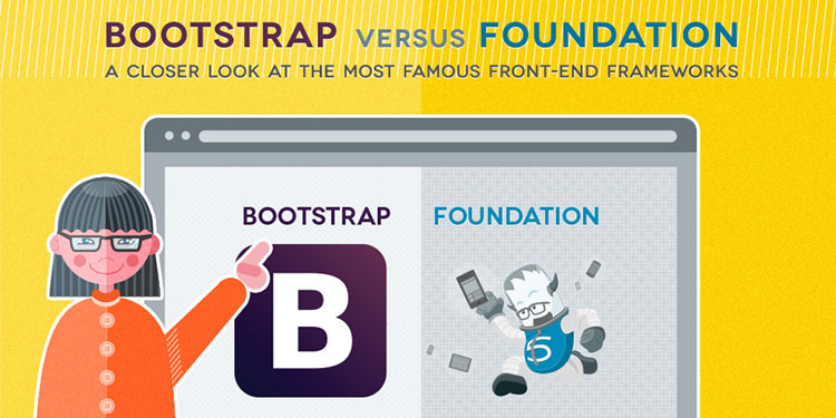
If you’re a web designer who’s looking for a sleek, simple and responsive front-end framework, you’ve probably heard of both Bootstrap and Foundation. That’s because these are the two most popular frameworks around right now.

In your mind, you’re probably also thinking…Bootstrap vs. Foundation…Bootstrap vs. Foundation! Which should I use? Which can get me to where I have a fully functioning, new website more efficiently? Relax—we’ve got you covered.

Before we dive into the details of each framework, know that each one has its pros and cons. At the end of this blog post, you’ll make a decision on which is better based on your unique situation, your needs and your familiarity with code in the first place.

That said, Bootstrap was created by former Twitter employees while Foundation is the brainchild of ZURB, an interaction design company that can boast a client list that includes eBay, Facebook and even the NYSE.

We want you to be armed with all of the latest information about each framework, so that you can make the best decision for your web-design projects. Let’s dive right in.

The Grid System

The most noticeable part of a front-end framework is its grid system. With a grid system, designers are able to prototype various layouts and then make any necessary adjustments as they see fit. Foundation initially made its name with the grid system, being the first of the two frameworks not just to go responsive, but also to really flesh out the mobile-first approach for a period of time.

However, after some time, Bootstrap caught up and has closed the gap. In other words, any slight advantage that Foundation had at the beginning with its grid system is pretty much gone now.

Still, there are a couple of specific grid features in Foundation worth mentioning. It’s called the block grid, and it empowers designers to efficiently divide the contents of unordered lists into a grid that’s evenly spaced. In addition, Foundation also makes it a cinch to quickly collapse columns as well as remove gutters because of the collapse class. Alternately, you can remove center columns by using the center columns syntax.

Designers have the ability to produce equivalent code snippets in both frameworks that function almost in the same way. Even so, the syntax for building grids can be a tad different, which means that personal preference will be the decider in the end.

Now let’s talk flexible and pre-defined grids. Both Bootstrap and Foundation come with a default grid system that’s totally in your hands to customize with Less and Sass, respectively. Bootstrap’s default grid mode is attached to breakpoints. This means that it’s going to give you static-sized widths that’ll recede when the viewport is at its limit. However, if designers use the class .row-fluid instead, the width relies on percentages (just like Foundation).

bootstrap-grid-system

Sizing Units

When it comes to calculating typography, widths and basically everything else, Bootstrap relies on pixels, but Foundation uses rems. There are clear differences between the two, yet both can create the same outcomes. Again, it’s a personal preference thing for web designers.

While pixels may feel more familiar to web designers and graphic artists without that much experience, rems help designers think more about proportions. Think of pixels as absolute units while rems are relative units. That’s something to consider, especially in this day and age of responsive design.

At the end of the day, though, don’t beat yourself up too much about the distinction between the two. It all comes down to personal preferences and comfort levels: If you’re a fan of working with pixels, then Bootstrap is the framework for you! When you use pixels, you’ll have to specifically set the width, height, padding and margin of components and their nested elements on each target device and screen size you’re working with.

Features

To someone just getting familiar with both front-end frameworks, it would seem that both have an almost identical collection of pre-built features. As always, looks can be deceiving, which is why there are actually small, but important differences between the two that you should familiarize yourself with.

Foundation comes with built-in form validation from Abide. Bootstrap doesn’t have this feature, but that’s not an issue by any means since, again, it all comes down to the designer’s personal preference and what he’s most comfortable working with. Interchange is another feature unique to Foundation: It relies on media queries to load responsive content that’s suitable for different browsers. Right-to-left support, off-canvas navigation, tours and pricing tables round out the features list of Foundation.

Bootstrap, on the other hand, comes with features that feel more complete and thought-out, from the standpoint of designers. Look at it this way: The features that come pre-built with Bootstrap are much more conducive to efficiently getting designers up and running with their objective of building a functional website with a theme. So if you value productivity, then Bootstrap has to be your framework of choice.

Bootstrap’s also added responsive embeds, which makes it a cinch to now incorporate responsiveness to different elements.

The Ability to Customize

Just by looking at the names of these two, front-end frameworks, you can glean something about the visual customization of each. Bootstrap removes friction from your path, so that you can create a website as efficiently as possible and have it up and running; Foundation tends to offer a few more customization options when it comes to visual appearance, which can slow you down a bit.

With Bootstrap, your websites tend to appear as though they were made with Bootstrap—that is to say that the default Bootstrap look, if you will, only goes away when you either add a theme or spend some time with custom styling. It’s all good, though: If you don’t want people to know off the bat that you built your site with Bootstrap, just explore the custom styling features to add more unique touches to your website’s appearance.

By the way, you can thank Bootstrap’s early popularity (it’s more popular than Foundation) for this so-called “Bootstrap look.” Foundation, by comparison, has a default appearance that looks a lot closer to how your browser would look, in many cases. As a result, it’s a bit simpler to tweak and shape into a more individualized and unique design look.

dragonfly-business-responsive-theme1

A quick word on themes: When it comes to sheer choice in the theme department, Bootstrap can’t be beat. It has a larger assortment of themes that are readily available. Sure, Foundation themes are available as well, but just know that they’re not available in as much abundance as Bootstrap themes are. And, unless you’re a designer who just wants to have all of your websites more or less look the same, you’ll naturally appreciate the greater variety and more choices that Bootstrap’s themes offer.
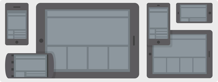
Mobile

Because of responsive design and the increasing popularity of mobile use, you’d be crazy not to design ANY site with mobile in mind. It’s interesting to point out how each front-end framework handles the mobile question.

Foundation’s approach is to encourage designers to tackle the mobile question head-on by its easy-to-follow rule:

Anything not under a media query is going to be considered as mobile

Now, should designers want something to look differently on a computer or tablet, then they’ll have to specify the media query. This is known as mobile-first CSS development.

foundation-grid-system

Bootstrap approaches the mobile question from a totally different angle. Should designers want to design for mobile, they’ll have to specify the media query for it. If designers don’t design for mobile first, their mobile users are simply going to have to contend with seeing the desktop view.

Designing elements with a desktop-first mentality means you’ll have to think a little bit harder to successfully arrange all your elements on a mobile screen, but it’s totally doable. On the other hand, Foundation’s mobile-first approach obviously lets designers focus more on what sort of content is relevant and interesting to the user while space considerations are secondary.

Browser Support and Performance

Browser support and performance are both very good on Bootstrap and Foundation, with one exception: Foundation does not support Internet Explorer 8. If that doesn’t bother you, then that’s your call, but some designers may feel restricted by that lack of support.

That said, when it comes down to sheer performance between Bootstrap vs. Foundation, the differences aren’t all that great…or even that noticeable. Sure, there will be some minimal performance gaps, but these are largely based on the specific features (framework components, browser environments, etc.) that support designers, as opposed to issues surrounding the front-end frameworks themselves.

Community and Support

If there’s one category that favors one framework over the other, it would have to be community, where Bootstrap clearly has the upper hand. Bootstrap has a huge following of designers and developers which means you’re more likely to get support if you run into issues.

In addition, there are a wealth of plugins and widgets that can be strapped onto the framework, which further extends Bootstrap’s functionality for more efficient web development.

Bootstrap vs. Foundation: Which Framework Wins?

When it’s all said and done, the question isn’t really that simple. As we’ve talked about, there are pros and cons to each front-end framework, and whether designers want to choose one over the other largely depends on their personal preference and comfort level.

If you enjoy having a large selection of themes, then Bootstrap is the way to go. No doubt about it. If you have a preference for rems over pixels, then maybe Foundation isn’t so bad after all. If you want to enjoy support for Internet Explorer 8, then better stick to Bootstrap. However, if designing for mobile first is important…well, Foundation puts an emphasis on that. Then again…if community support and more choice in the form of plugins and widgets are important, you can’t beat Bootstrap’s bigger following and larger selection.

At any rate, if you enjoy building stellar websites that live on the Internet, you can’t really go wrong with either front-end framework. So ask yourself what features of each are more useful to you. We hope we’ve helped make the decision for you a whole lot clearer!

If you already use one framework over the other, be sure to let us know why in the comments below.

PSD to HTML conversion using Bootstrap Responsive framework

When Twitter was expanding, Mark Otto and Jacob Thornton realized the need for a standardized framework and tools that would facilitate consistency and ease of development in the expansion of the Twitter website. The project took a life of its own and we got an HTML and CSS toolkit, named Bootstrap or formerly Twitter Bootstrap, which made the process of web development a little easier. Bootstrap is currently used by many different types of web sites, including NASA and MSNBC, and is currently one of the most popular open source projects on GitHub.

To convert a PSD image design to a responsive HTML website, the most important step is to write the style CSS that ultimately dictates whether the site is responsive or not. Bootstrap helps in writing this CSS code. To be more precise- it’s the CSS code that could be used in creating a responsive website.?

Now, the question comes what exactly is bootstrap and how can we use it. To explain it in a single line- ‘Bootstrap is a collection of tools and HTML/CSS templates that could be used to build a website’. And since Bootstrap version 2.0 (the latest version of bootstrap), has support for responsive web development it can be used to build a responsive website. As for what it can be used for, well it can develop any type of website and could be used with any type of content management system (CMS) that has support of integrating custom CSS, such as WordPress, Joomla, Drupal etc. The best thing about this framework is that it is supported by every major web browser such as Chrome, Firefox, Internet Explorer, etc.

What is a responsive website?

A responsive website provides optimal viewing experience to a website even when viewed through different screen sizes. Here, optimal viewing means accessing website content with minimum to no left to right scrolling and good legibility of text, images, and other media. Therefore, for optimal viewing the website must automatically adjust its rendering width, images sizes, and text size according to viewing screen size.

How responsive websites are generally made?

To make a mobile compatible site, web developers generally use two major techniques. One is by using an altogether separate domain such as m.example.com or example.com/mobile, and redirecting the mobile traffic to this domain. Of course this domain contains the mobile optimized version of the site. This approach, though gets the job done, has a number of disadvantages related to search engine optimization of a site such as duplicate content, promotion of two separate domains, and diluting of link juice.

The other way is by creating a responsive website cleverly using CSS style sheets to render a different styled version of a website according to the screen size. The size of the screen is detected through Media Queries. The CSS used in this screen size loads a rendering style that most fits the screen. The only disadvantage is that the latest versions of CSS are not supported by old browsers such as Internet Explorer 6 thus they cannot display such CSS sites optimally. But this is also changing as more and more people are shifting to the newer versions of browsers.

Bootstrap: Making life easier for web developers

Bootstrap is a pre built CSS framework that could be used by web developers to create websites of any type. The framework provides tools that the developers can call from website’s HTML. Bootstrap has the basic style definition of all the major HTML components that you can use in your website such as alerts, modals, tool-tips, button dropdowns, dropdowns, button groups, navbar, navigational tabs, pills, lists, labels, page headers and hero unit, thumbnails, progress bars, accordion, carousel, and typeahead.

Bootstrap is based upon LESS, a dynamic style sheet language that is considered to be an extension of CSS. As such- LESS is considered to be way faster than other extensions such as SASS. And since it is written in JavaScript, it is easier to understand by a majority of web developers as most are well versed in JavaScript.

Though some professional web developers prefer to create custom code as much as possible, many uses Bootstrap CSS files to create their websites. The only disadvantage of Bootstrap is that it does not fully support HTML5 and is not completely built in CSS3. This is because only the latest browsers fully support these two technologies and most web users have not updated to these browser versions. So, to make a site completely compatible with most of the web browsers, some sacrifices have to be made.

Getting started

Let’s get started with bootstrap now. But before we proceed to bootstrap it is important to note that no matter how easy using bootstrap may sound, you can never harness its full potential unless you have a complete idea of CSS and HTML. Also contrary to the popular belief, programming languages, or more specifically CSS and HTML programming languages, are not that difficult so you can easily master CSS and HTML in 3-4 months. Here’s a list of some great resources through which you can learn CSS and HTML on Internet.

For using Bootstrap first download the compiled version from http://twitter.github.com/bootstrap/index.html. The site has the facility to allow you to customize the Bootstrap framework according to your needs. This is the miniaturized and compiled version and therefore you can get started automatically with it. It does not include any source files. If you wish to download the source, visit here {https://github.com/twitter/bootstrap/zipball/master}. However to use it you have to first compile it.

Once you have downloaded the zip file extract it in a folder. Now you will have to initialize Bootstrap in the head section and the associated JavaScript in the body section

<head>

<meta name=”viewport” content=”width=device-width, initial-scale=1.0″>

<link href=”css/bootstrap.min.css” rel=”stylesheet” media=”screen”>

</head>

<body>

<script src=”http://code.jquery.com/jquery.js”></script>

<script src=”js/bootstrap.min.js”></script>

</body>

A thing to note here is that you don’t need to call JavaScript here as all the major components will work without it. But some functions such as alert and dropdown menus and buttons use JavaScript to give stylized animations and functions.

Bootstrap Grid

Bootstrap comes with a 12 column grid and is available in both fixed and fluid grids. For those who don’t know, fixed grids use exact column width in pixels whereas fluid grids uses relative lengths that is represented in percentages.

To make the website responsive, Bootstrap uses the fliud grid system that modifies the width of the column in the grid and resizes the heading and the text accordingly. Similarly the fluid grid also resizes the images as image sizes are also entered in percentages. In addition to make a responsive site you have to use stack elements instead of float. Though you can make a responsive site using fixed width, but it is not generally preferred.

Learn Bootstrap

Now as we said earlier, you cannot understand bootstrap completely until you have learned CSS and HTML. For those who have knowledge of these two languages, following are some great resources for learning Bootstrap and making a responsive websites.

  • The official GitHub site of Bootstrap :- This site is the best source of learning Bootstrap and all its components. It has detailed examples of every feature of the framework and how it can be used.
  • W3resources:-is really a comprehensive tutorial about bootstrap. It includes all there is to know about the framework including its working, its usage, and examples, along with its integration with JavaScript plugins and their usage.
  • Webdesign.TutsPlus:- It has a complete video tutorial series about Bootstrap. It contained detailed videos about uses of every major component of the framework.
  • One Extra Pixel:- This tutorial is for those who are proficient in CSS and HTML and are just gathering the basic idea of Bootstrap without delving much into the framework.

JavaScript and Bootstrap

Bootstrap comes with JavaScript files that have supported different components of the bootstrap framework and thus extends the abilities of these components. The best part is that all the plugins come in a single file and you can access all the plugins through simple mark API without writing a single line of JavaScript; though you can turn off this feature. The main components that use JavaScript in Bootstrap are affix, alerts, buttons, carousel, collapse, dropdowns, modal, scrollspy, popover, tab, tooltip, transitions, and typeahead.

Conclusion

Bootstrap makes life easier for programmers who want to create responsive websites. But they are not the only framework out there. There are other Responsive CSS frameworks such as Foundation, Intuit.css, LESS Framework 4, etc.In addition it is important to note that Bootstrap is an open source project that is constantly evolving and changing. So, it may not have a complete support for HTML5 and CSS3 at present, it may have in the future.

Free Download Foundation Grid PSD (Photoshop)

Free Download Foundation Grid PSD (Photoshop)

With the new foundation 6 grid you have gutter width and column. and the container width includes two half gutter padding on the sides.

You will find:

  • mobile 300 1 column psd
  • tablet 724 12 column psd
  • desktop 940 12 column psd
  • large screen 1170 12 column psd

[sociallocker id=69]Download PSD[/sociallocker]

Why You Need to Convert PSD to HTML using Bootstrap?


If you are a web designer then you are aware of PSD and its importance in your life. And, if you do not know about PSD then just consider it as a basic tool of web designing. It is a proprietary file that is basically utilized in the design to code process of web designing.

It is easy to edit image layers while utilizing PSD file format. Designer can’t edit the layers of image after he/she completes the image and convert it into a non-propriety file such as .GIF, .JPEG or .TIFF.

Web designers whether beginner or experienced, must know how to convert PDF to HTML to design creative and responsive websites. If they do the conversion using CSS Code then this conversion provide them more detailed and easy ways to create site more accessible.

Writing CSS code is not at all a simple task and for that you need a competent framework. Now, it is easy for you to do this task through Twitter Bootstrap. It is an efficient combination of HTML, JS and CSS from Twitter. Bootstrap is a best invention of Twitter which is now widely used to create innovative and responsive, cross browser compatible and more user friendly websites without any problem.

Bootstrap is the latest, intuitive and most favorable framework in the current market trends among web designers all over the world because as you know that to convert PSD to HTML is very important part of website designing. So, you just need to search for professional, reliable and experienced company such as Only PSD 2 HTML to convert PSD to HTML.

You can extent your images by utilising Bootstrap with your customised requirement. Bootstrap provide a facility of Fluid Grid feature that makes image scaling much easier and hassle free to its users. You can use 12 Column Grid that helps you to put responsive features together to the site. It is compatible with almost all image modes like RGB, Duotone, Bitmap, Lab, Multichannel, Grayscale, Indexed Color, and CMYK. It supports from channels to multilevel information and from clipping paths to transparency levels.

Now, the question arise in your mind that why you should go with the Twitter Bootstrap than others. All the above benefits of bootstrap make it different from other frameworks. The main benefit of it is that it is more responsive, efficient and powerful mobile first front-end framework with some great features for fast and easy web development. Using Bootstrap, you can create well documented and detailed CSS code.

If you are looking to create the pixel perfect, user friendly and very responsive website then choose a reliable firm. Get a reliable PSD to HTML using Bootstrap or PSD to Bootstrap service provider company – Only PSD 2 HTML.

PSD to HTML Conversion in Five Easy Steps

What is PSD to HTML?

PSD to HTML Conversion is a very significant way to create and optimise browser compatible websites as per client’s business nature. In general, “PSD to HTML” is a workflow. Firstly, a website page has to design in a PSD (Photoshop Document) and then convert to code using HTML, CSS, and JavaScript. You can switch Photoshop with other image editors like Pixelmator, GIMP, etc. but the base remains the same.

You can get more detailed steps mentioned below:

  1. Make a highly reliable pixel-perfect mockup design in Photoshop that can fulfil your exact site presence requirement.
  2. Utilise slice tool to part your website’s imagery and then export it for the web.
  3. By using the website’s imagery exported for the web, you need to write HTML and CSS

It seems a very good idea at first glance. But, it is not an easy to start coding if you are a beginner and do not know the ultimate result. Therefore, first start work in Photoshop and then follow the above given steps. If you think to hire someone how is expert in PSD to HTML Conversion service then just do that because PSD to HTML is an affordable.

5 Easy Steps to Convert PSD TO HTML:

Website is a backbone of each and every online business. Web designing is first created in the PSD format then it is converted into HTML markup. You can find that for every website development project, PSD to HTML conversion is very important aspect. As I said earlier, it is not a simple tasks of conversion and if you are not a developer then you have to take care of some important points on how to convert PSD to HTML before doing conversion.

Below given are few of the most important steps you should know that how to convert PSD to HTML:

Step 1: Fundamental Working Ideas:

Fundamental-Working-Ideas

  • Most important step in PSD to HTML conversion
  •  Decide the fundamental points behind building a website
  •  Understand the expected result and nature of the tasks then decide whether you need a professional or you can do it personally to perform conversion.

Step 2: Analysis of PSD File:

Analysis-of-PSD-File

  • In-depth analysis of the PSD file
  • Understand all the details you have analysed and the problems that appear in conversion
  • According to the analysis, organize conversion steps such as splitting mockup, addition of necessary CSS codes, etc.

Step 3: PSD to HTML Conversion:

PSD-to-HTML-Conversion

  • First of all, slice PSD image
  • After slicing gets completed you need to set layers
  • Then unite those layers and insert some elements to it

Step 4: Post Relevant Content:

Post-Relevant-Content

  • Quality content plays a crucial role in the website
  • Highlight the website objective, goals and advantages for visitors
  • It is important to make sure that the content is accurate to the website objectives otherwise, it destroys the whole design and leaves negative impact.

Step 5: Check Browser Compatibility:

Check-Browser-Compatibility

  • After completing all the above four steps, check your design in various browsers
  • It is required for each and every website design
  • Check that your design works accurately on various browsers otherwise you may lose potential customers

Following on this elements and process, several web companies have used PSD to HTML as a template for team workflows. If you are a beginner then this tutorial is for you. First, learn to code your PSD file with the above given easy steps. These five steps are the simplest points to learn how to code your web design, and best guide for basic markups knowledge holder.

Hope this guide will prove to be beneficial for you. If you are looking to design and optimise your PSD to HTML then Only PSD 2 HTML is a reliable place for you.